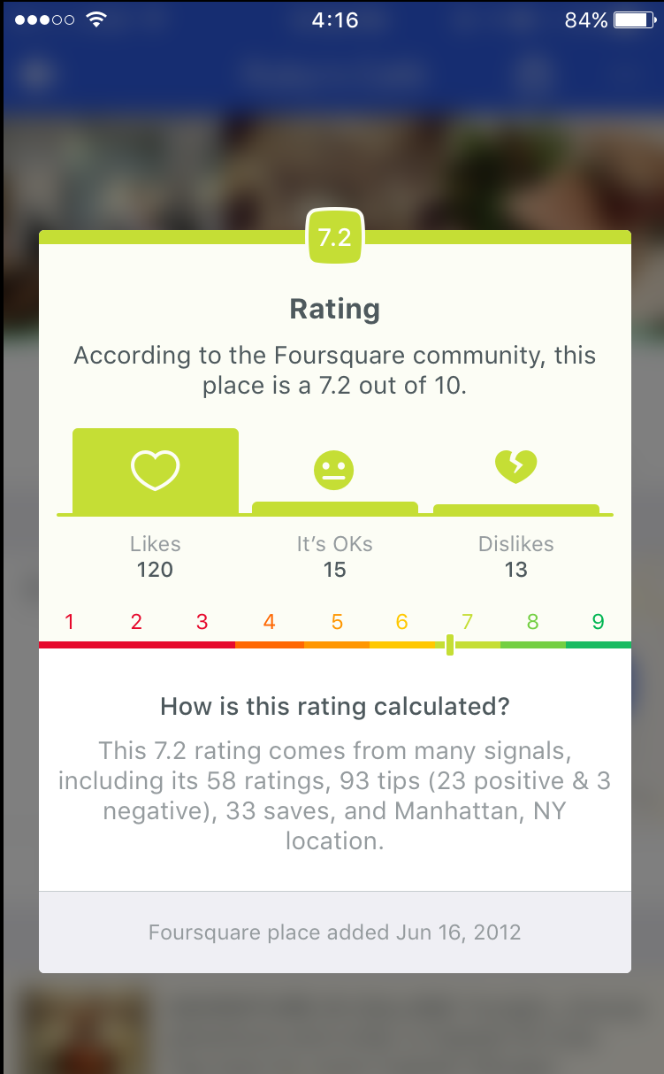
Problem: In research, we often heard many questions about how our ratings worked and why were they not clear. We wanted to explain ratings in a simple and quick way.
Telling that rating story had always been hard since Foursquare depends on more than just user ratings for rating calculation. The rating is calculated through ratings, tips sentiment, and foot traffic.
We tested out a few options in research including a more traditional 1 out of 5 rating and percentage ratings and found that users didn’t want an in depth explanation just a quick gut check as to why a place was rated an 8.7.
Goal: Increased insight into our venue rating calculations should lead to an increase in new user retention
Results:
-
Existing users that were shown the modal increased their core app activity by .3%.
-
These users were also 10% more likely to issue a search and click on a result.
-
Global CTR was pretty low at .16%. This is somewhat expected as we know that a user won’t always need to look at the rating breakdown on a venue. This could be also be attributed to the venue rating not appearing tappable or that previous attempts were not successful so users may not be inclined to try again.
-
Android had a higher CTR, globally than iOS (.36% to .08%), particularly with First Week users. Android had a .83% CTR compared to iOS’s .19%. This may be attributed to the animation on Android being more pronounced than on iOS.
